 If you read this space on a regular basis, you may have noticed that I tend to complain about interior controls and layout on “today’s” cars … a lot.
Seems to me manufacturers are focusing too much on gimmickry and glitz and less on functionality and user-friendliness. Some cars – no matter how often I drive them – seem to confound me over and over again with their non-logical switchgear and monitor-centric controls.
Mazda products are a prime example of how not to design switchgear, but they’re not the only ones.
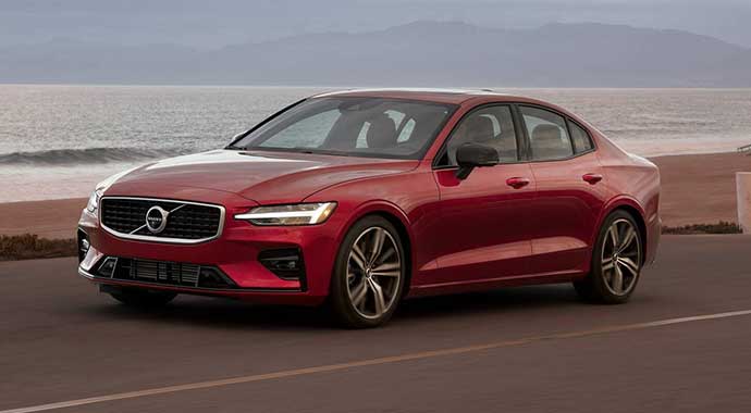
The all-time winner for stupid control layout and just plain difficult switchgear has to be Volvo, specifically, the S60 B5.
| Click image for larger view |
 |
 |
| Related Stories |
| Volvo XC60 balances performance, economy and comfort
|
| Volvo XC-90 plug-in hybrid is a luxurious, high-tech hauler
|
| The stylish, all-electric Volvo C40 Recharge
|
| MORE AUTO REVIEWS |
But first, some specs.
Power for the S60 B5 is provided by a 2.0-litre four-cylinder that is turbocharged and mated to an eight-speed “Geartronic” automatic transmission. It develops 247 horsepower and 258-foot pounds of torque. It also has full-time AWD, and its combined fuel economy is 8.3 L/100 km. This is a beautifully co-ordinated drivetrain, with smooth linear power delivery and absolutely gobs of reserve power. Zero complaints in the powertrain department.
Needless to say, there are safety features in abundance, including oncoming traffic alert, a collision avoidance system that works day and night, blind spot warning, lane “drifting” alert, adaptive cruise control, no less than four peripheral cameras, and a back-up warning system that stops the car instantly if something is detected behind you.
I experienced this last feature first-hand; while I was backing the car up at the local mall, a pedestrian darted in behind me, and I honestly thought I’d hit him. It’s that dramatic. These are all handy features and pretty much standard throughout the industry these days.
Moving on to the inside of the car, let’s start at the beginning.
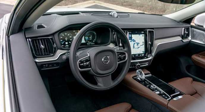
First up, the start button is not a button at all, but a console-mounted, kind of built-in fob that you turn to the right to both start the car and shut it off. Works well enough, but it is kind of pointless … what is the advantage of this setup? There isn’t any. An old-fashioned key would work just as well.
Moving up to the shift lever, two taps are required to get into Drive or Reverse. Again, absolutely pointless: it doesn’t make the driving experience any better, and because the transmission doesn’t always respond after the second tap, it actually makes parking more complicated than it should be. Annoying.
But my favourite has to be the touch-screen controls/driver interface. Pretty much everything is controlled via the centre monitor, which features a touch-slide feature that handles everything from changing radio stations to accessing the HVAC system to getting to the GPS system.
If you’re stationary and parked, I suppose you’ll figure things out eventually, but the system is still unnecessarily clumsy. If you’re in motion, forget about quickly changing radio stations, using the apps, or bumping up the heated seat controls. You can’t hold your hand steady enough, and you end up not getting what you want. Not to mention taking your attention away from the most important function of all: driving the car without crashing into that bus in front of you.
As well the sound system is a four-step process. It’s got a lovely, hi-falutin-sounding name, Bowers and Wilkins, but even my local Volvo rep had trouble figuring out how to find AM radio, for example. The whole system is absolutely nonsensical and useless and would stop me in my tracks were I even considering this car. What a mess. No wonder there are so many safety features on the S60: you’ll need them when you smash into something while being distracted by the controls. Yes, you would probably figure everything out after you’d lived with this car for a while, but that doesn’t change the fact that the controls take your mind off the road ahead of you. For a company obsessed with safety, Volvo has completely missed the point these days.
Let’s not forget about the price. The S60 B5 starts at $52,750: my tester was $63,300 before taxes. That’s sixty-three large worth of frustration, in my books.
Used to be that Volvos were straightforward, easy-to-get-along-with, sensible transport. Over the years, I’ve owned a 122 and a couple of 240s. They are among my favourite cars, but today’s breed of over-complicated, user-hostile, hyperactive, technically overwhelming Volvo bears no resemblance to my youth’s cars.
Pity.
Ted Laturnus has been an automotive journalist since 1976. He was named Canadian Automobile Journalist of the Year twice and is past president of the Automobile Journalists Association of Canada (AJAC).
For interview requests, click here.
The opinions expressed by our columnists and contributors are theirs alone and do not inherently or expressly reflect the views of our publication.
© Troy Media
Troy Media is an editorial content provider to media outlets and its own hosted community news outlets across Canada.


